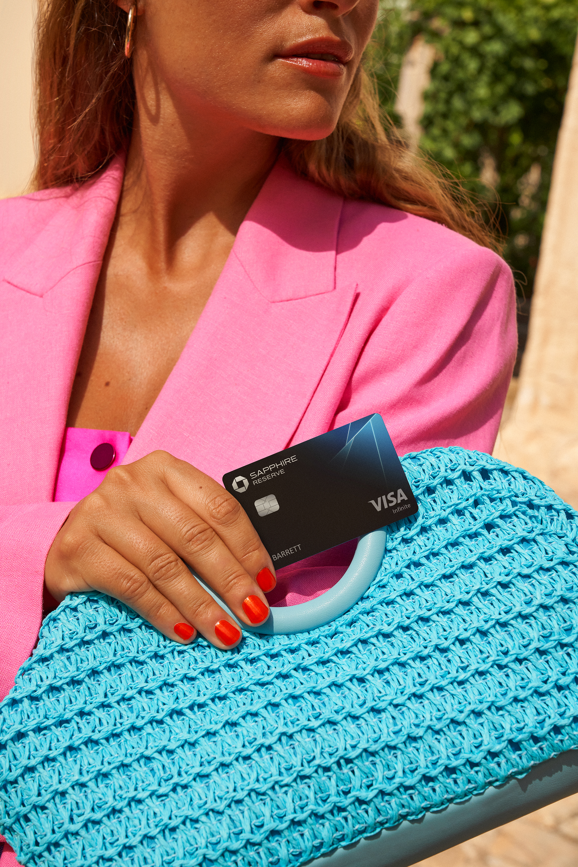
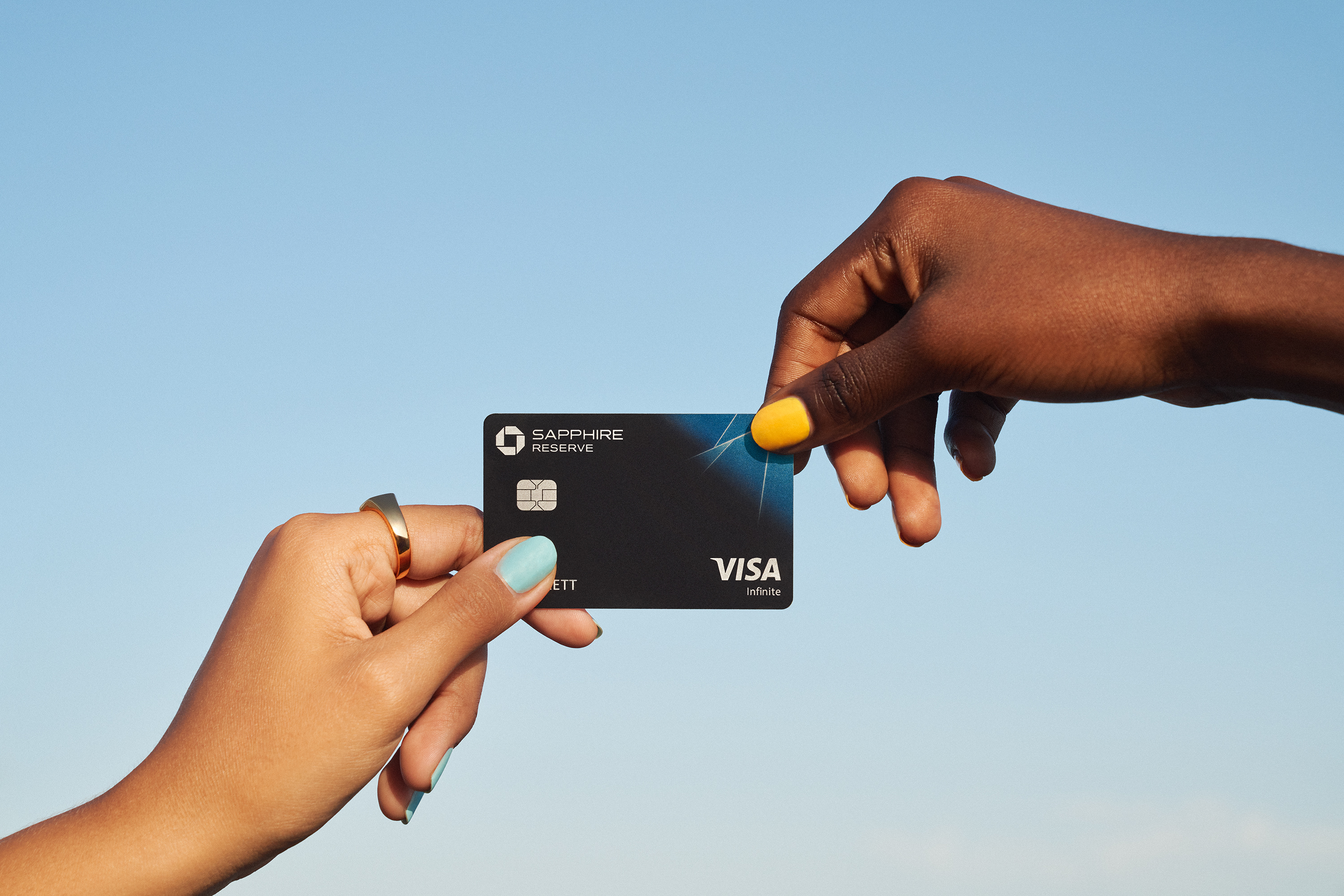
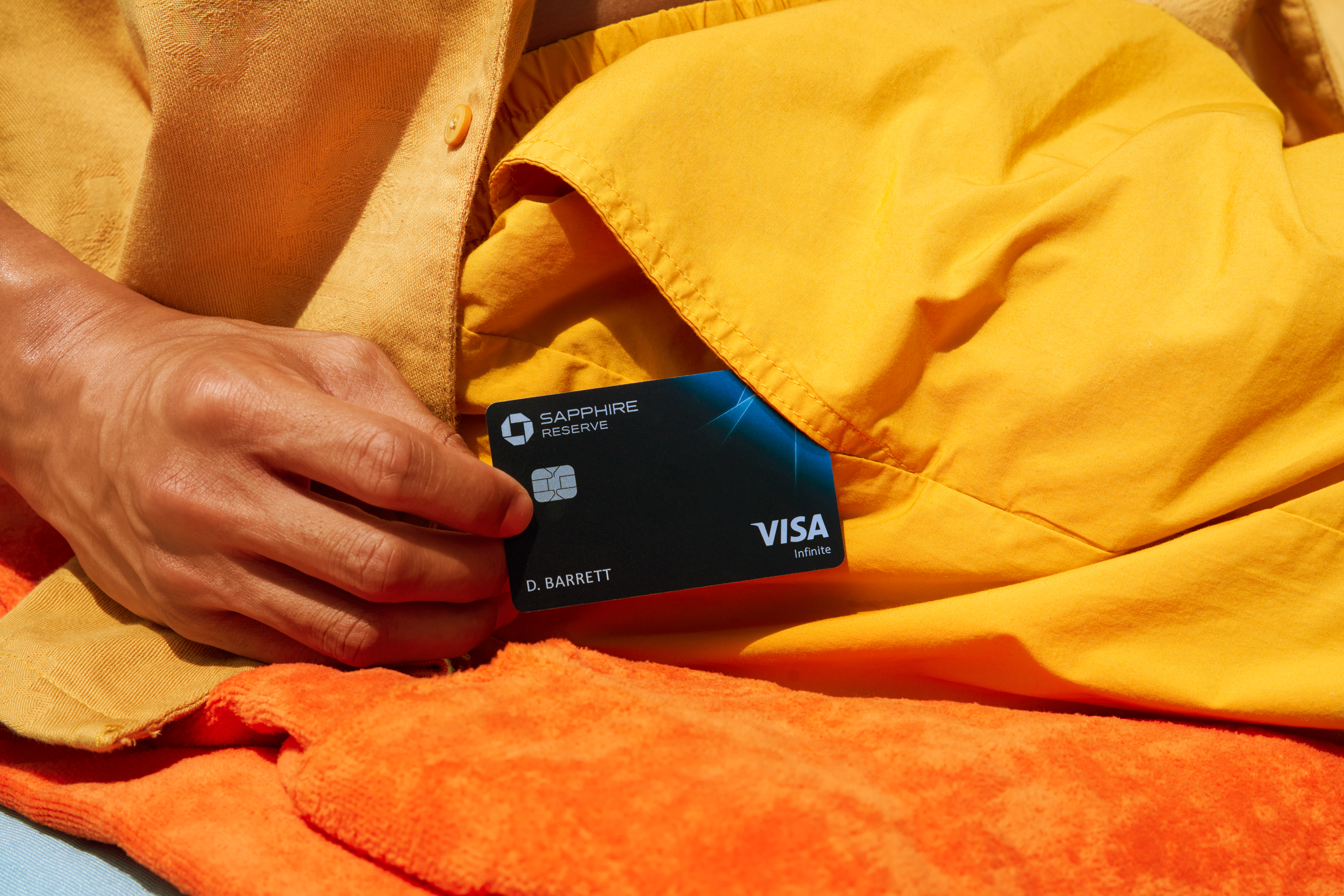
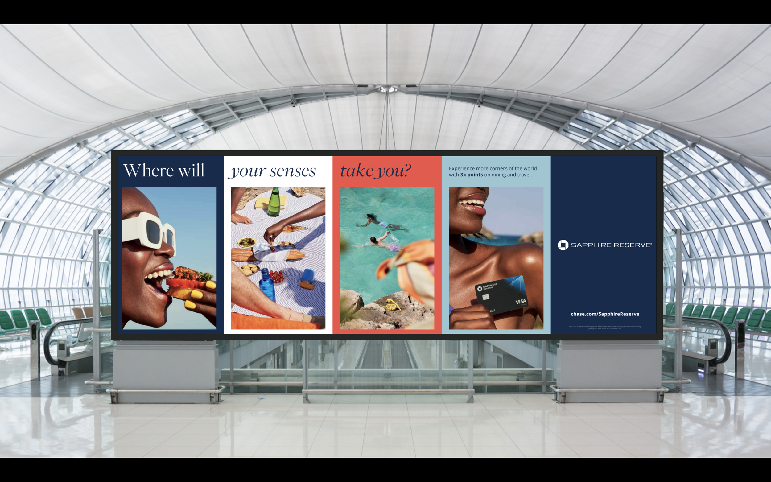
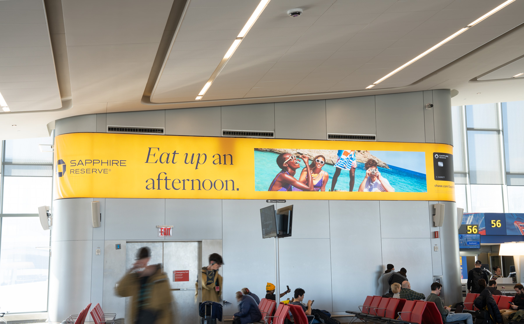
Part of the visual refresh was to help reposition Chase Sapphire Reserve as the travel card tied to exciting experiences.
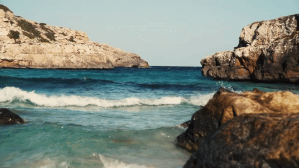
This meant saying goodbye to their dark blue visual identity and muted photography in exchange for new imagery and color palettes that were brighter, more vibrant and alive.
We worked closely with photographers Iris Humm, Mark Mahaney and Clarke Tolton to create our new visual approach.
This meant saying goodbye to their dark blue visual identity and muted photography in exchange for new imagery and color palettes that were brighter, more vibrant and alive.
We worked closely with photographers Iris Humm, Mark Mahaney and Clarke Tolton to create our new visual approach.


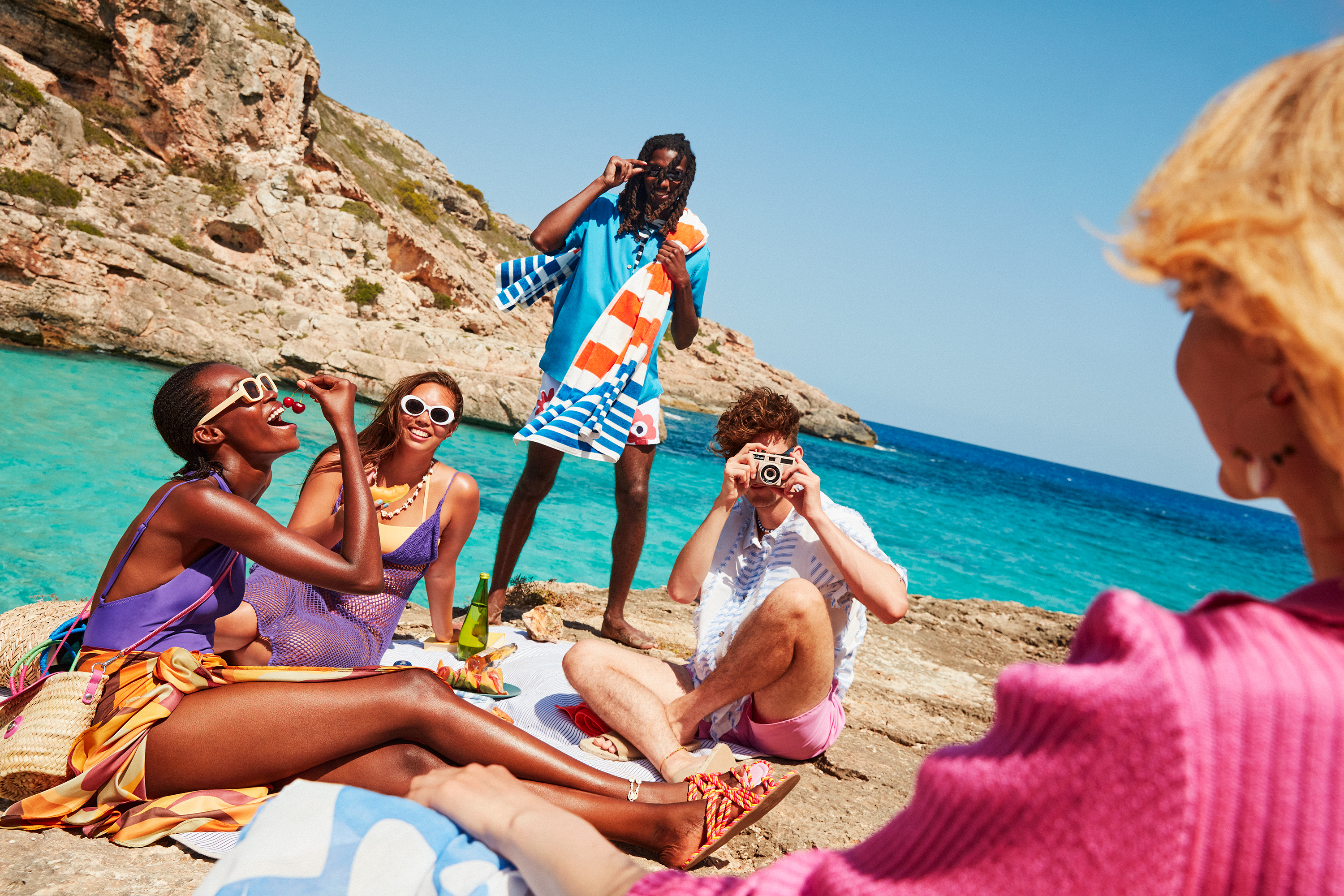


We moved away from corporate template style design and further into a more editorial space with enticing headlines, more immersive photography and a much more playful layout.
The new visual identity launched at various airports like LGA, BOS, PHX.
The new visual identity launched at various airports like LGA, BOS, PHX.


As for the card art, we also wanted to rethink this and treat the card more like an accessory – since it truly is while you’re traveling.